
Wednesday, 19 December 2012
Choreography/movements
Story board and animatics
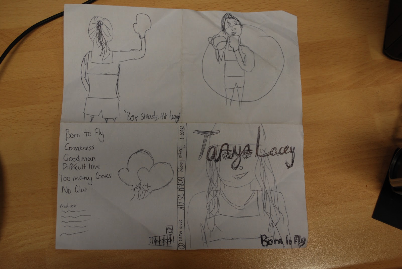
We then finished off our storyboard with writing in the time and what happens in each shot so our next task was to begin making our animatics which is a very vague stop motion type video showing our ideas for shots. In doing this we realised that our shots were too long to be an upbeat music video for a pop type genre so we needed to make some changes by adding shots. We added a few close ups and gave a more varied type of shot because to begin with all our shots were pretty similar being long shots. Our deadline for the animatics is 20th December, we will have completed ours by the deadline. When creating the animatics we had difficulties with the software however it became more simple the more we played around with it. We used colleges cameras and uploaded them to the computer and edited the video in premier pro. We then needed to download the track so we could fit it all together, we did this first before putting any images in so we could make sure they all fitted to the timings we required. We downloaded the song using youtube converter which made it quick and easy.
This lesson 19/12/12 we will be finishing off the animatics for the deadline, we are going to change the shot list which we started on, last friday because we have changed a few of the shots timings.
This lesson 19/12/12 we will be finishing off the animatics for the deadline, we are going to change the shot list which we started on, last friday because we have changed a few of the shots timings.
Tuesday, 11 December 2012
Music Video Planning
11th December.
Syra and I began creating our storyboard for our music video. We spoke about different shots we would use and timing.
Syra and I began creating our storyboard for our music video. We spoke about different shots we would use and timing.
- We discussed that we are still using our model Thea which we used for the digipak, we are going to use her as the artist and there will be a high level of performance.
- We also spoke about the costume we would have her in and that we didn't want too many costume changes to make it less complicated. We have decided on bright colours for the costume with lots of sporting type gear.
- Our locations are going to be simple to use however we will need to organise with a fitness centre as to when we can have access to a boxing ring. We are also going to use a graffiti wall by nunnery wood and the canal.
- The props we are going to use are boxing gloves, cupcakes and a dog for the first few scenes.
Friday, 7 December 2012


Thursday, 6 December 2012
Photoshoot organisation
I have organised the photoshoot to be done on Wed 19th of December with Syra as we are both using the same model. I have borrowed most of the props from friends, I have borrowed boxing gloves from Holly, sports bra from Claire and I brought in the jewellery myself. I am using one of the colleges cameras and will then edit the photo's using photoshop. The setting I am using for most of my images will be the college as they have backgrounds and lighting perfect for the effect I want to create. I am going to take 2 images using a white background and 2 using a black one. I was unable to find a boxing ring willing to let me photograph in so I had to change my CD inlay image which I had decided on back up for it initially.
Wednesday, 28 November 2012
Digipak Organisation

 The model I have chosen is one of my close friends. I chose to use her because it is easy for us to organise a photoshoot. Also I feel it will be easy for me to use her in the way I want to, to fit into my genre of music. I feel she is generic to my genre. The costume I am going to use relates well to our ideas for our music video. I am going to have her in a sports bra, a beanie hat and some boxing gloves. I am going to have the model wearing jewellery. My concept is a boxing theme because this will also be a key feature in our music video when we come to make it. I decided to keep this feature in my digipak because I think it shows the star persona through the images. The setting of one of my images will be the corner of a boxing ring with the stool and other props similar to what we will show in the video. I have phoned a gym in Worcester to ask for permission to take the photograph. The other images will be set in college using the white and black screens with the lighting.
We have organised to have the photoshoot on Wednesday, 5th of December because the model was unable to do the originally organised shoot. During this I will take all my photographs including the boxing ring one.
I am borrowing the boxing gloves from a friend and the model already owns the sports bra. I am going to do subtle make-up on her however bright coloured lipstick. I am going to purchase the beanie from a store in town before the shoot.
I have already sorted the exact font and writing I would like on my digipak. I want all the images in black and white because I think it looks effective with a pink font.
Tuesday, 27 November 2012
Rough Draft Digipak
Monday, 19 November 2012
Digipak Research


 For my digipak and magazine advert I want it to be very similar to that of most R&B/Pop artists. For my concept I would like to have although like the front cover she is innocent the inside will be like a party type setting with her behaving how she would when she's with friends. This will show the persons star persona. I would like to keep it redundant to R&B however have entropic elements because it is not just an R&B song, it is quite Pop too. The front cover will be slightly more subtle than the other images. I would like to have a plain image for the cover of the CD because the ones I have researched have featured an innocent looking female on the cover with bold writing around it. For the magazine advert I would like to use the same kind of image from the digipak with the same font and colours on the artwork to make it iconic of the artist which is what Jessie J's digipak and magazine advert are like. The brand identity I am hoping to establish are that she is innocent which reaches out to the younger generation however young, free spirited, determined and successful. I would maybe like to have an image of the artist boxing a punch bag to show determination which will follow on when it comes to our music video. I will make the image look less innocent and plain by having bright red lipstick and bold jewellery. My ideas have been based on the digipaks I researched which were Rita Ora, Rihanna and Jessie J. These all have clear similarities and I wanted to also create one similar. They all have things that are iconic of that artist, in Rihanna's she has her red hair and lipstick, Rita Ora's is her font and the colour red, and Jessie J's is her autograph type font which she has used throughout all adverts and products. I would like to create something iconic for my artist, whether it is a font or a hairstyle. It gives a recognisable feature for the audience. I want it to be very clear what type of artist she is and show this through images.
Wednesday, 14 November 2012
Audience Profile


 Our audience for our contemporary R&B music video will be the younger generation who enjoy mainstream music. They will be D to C1 on the jicnar scale this means they will be the lower end of society. The ages will range from 16-25. They are from College to School and University. The type of people who watch shows such as X factor. They will have a very mainstream fashion sense and enjoy partying and socialising in their spare time. A standard weekend for them will involve meeting up with friends, going out to town and getting really drunk. They wont be particularly glamorous because they have an urban edge to their style so will shop in various places including Topshop and River Island. They listen to people like Rihanna, Jessie J, Rita Ora, Chris Brown, Tinie Tempah and Nicki Minaj.They will wear make-up however not to excess.They may be in relationships or not because this genre features love and independence. They dislike indie and rock music. However enjoy Pop, Hip hop, R&B and rap. My audience will attend festivals such as iTunes festival, big chill and V festival. They enjoy watching new music videos and searching for new artists on YouTube etc. They enjoy making new friends and meeting new people. They are outgoing and confident. The women are similar to the men because they both have an urban edge to their fashion sense, the men will be fashion concious and neatly groomed looking clean and fresh. They take pride in their appearance with a trendy hair cut fitting with society. The men will have tattoo's however not completely covered like rap artists are. They also have piercings.
Tuesday, 13 November 2012
Genre Music Video Research
 This music video is very similar to how we imagine ours to be. It is redundant to R&B/Pop videos not having a particularly strong storyline, most of the video is focused on showing the artists star persona which will be the demand of the record label. This video proves Laura Mulveys theory about the male gaze where women are objectified and there to be looked at which she is in this video however she is an alpha female when she begins boxing but still keeping the male gaze as a feature because she is not wearing appropriate boxing gear. The shots become much quicker as the chorus begins however the song is quite slow so most shots are long takes. There are quite a few dance routines which are taken in short takes with camera movement on a crane and zooming. During these dance routines it fragments the camera into parts of her body to focus on, e.g hands, feet. In female artists music videos there is quite often a good looking man which challenges the rule of the male gaze and gives a female gaze on the man topless. This is something we would like to include in our video because it will fit the target audience which are girls between the ages of 16-25.
Friday, 9 November 2012
Thursday, 8 November 2012
Our Choice Of Song
Wednesday, 7 November 2012
Research

Nicki Minaj (Rap/Hip Hop/Pop)
I chose this album cover because I like the use of bright colours, I think it fits with the genre because it appeals to a young audience. Also during my research I have noticed lots of the genre I am going for shows the artists face very innocently. Some feature male gaze type images but never too obviously because the target audience are young females. When making my digipak I am going to use bright colours (pop art) similar to this because I think it is very eye catching and fitting of the genre.

Beyonce (RnB/Pop)
I have chosen this cover because I think even though it is not bright like most in this genre it features a very plain image which gives a calm effect which I like. I would like my digipak to have a bold album name however small like one word or number like this. I like that all the writing is in the same font and the background is just plain. With my image I don't think I will use a male gaze type image because I want my target audience to be slightly younger than this. I think this target audience is older because of the plain maturity of the cover.

Jessie J (Pop)
The same as most pop album artwork this features an innocent looking artists face on the cover. I think this gives away the target audience very clearly because she looks young and innocent. The brightness of the image gives it an almost pop art effect with her bright lipstick and black hair. the simpleness of the image is what I intend to have mine as. The plain writing however with her signature name font looks effective because it is not too bold and overwhelming.

Rihanna (Rnb/Pop)
This is my favourite cover because I like the brightness of the image because it gives a pop art effect with her bright red lip and hair. The innocent expression on her face fits the genre which is young females because she is not over exposed or anything. I like the use of capital letters for the album name because it makes it bold yet not because its in a soft whiteish colour. I would like to use this sort of cover for mine because I like the effects used and I think it will fit my type of artist perfectly.
 Rita Ora (Pop)
I really like this digipak because of the use of black and white for images and bright coloured writing. With this genre there are usually bright coloured images with dull writing, with this being a redundant form of a pop digipak it is also amplifying because there are lots of differences. When I create my digipak I would like to have one similar to this, featuring similarities with a few differences. I like the use of one main bold colour throughout all the artwork. All digipaks show the label and distributors, so I would be required to do this. Rita Ora's digipak connotes her star persona through images, these show she is bold, outrageous, youthful and informal. The images show her to be very relaxed and down to earth which make it easier for her fans to connect with her on a personal level, this is common in Pop digipaks. It is common for Pop albums to have names very simplistic whether they are one word or just a number which I will include in mine. I think showing the artists star persona is very important because it shows they are serious in the industry and well known.
Important Features:
- Barcode
- Parental Advisory
- Tracklist
- Copyright information
- Artist name and album (front and back)
- Images of the artist
- Website/Fansite
The CD is bright red creating a strong contrast with the bold white writing which stands out to the audience. Still keeping with the colour scheme with the same font and capitals.
The back cover shows lots of images of the artist in different ways. These images give a good view of her star persona to be very childlike, carefree and fun however determined and confident in the music industry. Still keeping with all the patterns of red, white and black writing with capital letters. The side panels show the album title and artists name including her record label.
Nicki Minaj (Pop/Rap/HipHop)


Album advertisements have become much less common due to illegal downloading, record labels would much prefer to put money into advertising their artists tours. I have noticed this during my researching. This has changed my idea from creating an album poster to create a poster for an arena tour.
Typical conventions of a music magazine advert are:
- An image,usually from the digipak
- The date the CD is out or released
- Band name
- Album name
- Reviews e.g. 5 stars
- Available from e.g. HMV, Amazon
- Record label logo
- Tracks featured
- Website
- Slogan/strap line
- Tour date
- Limited Edition
- Offers to download
- Quotes from newspapers and music magazines
- Name at the top of the advert

.jpg)
.jpg)
Both Jessie J's tour and album album advertisements are basically the same, they both have common factors which the audience will be familiar to, for instance the black, gold and white colour scheme. They both have the same image, they have similar contents too. They are both very plain with minimal information however there are still clear demands from the record label in smaller font on both posters. On my advertisement I am going to create on for a tour because it is becoming less common for artists to have album adverts, they are now promoting them more themselves by having appearances on popular shows ect. I would like to use a colour scheme with a bold interesting image similar to Jessie J's because I think it is very striking and draws attention to it. Album advertisements always show a popular song which has hit the charts because the people feel the rest of the album will be just as good, like this one. Also the use of putting on their website is common in both tour and album posters. It seems like it is important to put only the key information because in this genre I have not found any cluttered posters from information, only from images.
Video Analysis
Justin Bieber – As
Long As You Love Me
This video is from Justin Bieber’s third studio
album, Believe (2012). Directed
by Anthony
Mandler, and edited by Jacquelyn London. It features guest appearances by Michael
Madsen and Big
Sean, the latter of which performs the rap on the track. The
video is more of a short film than a music video as it has a very clear
narrative. The video marks a key point in Justin’s career as a more mature
artist as opposed to his first album ‘My Worlds’.

The video is in the form of a short film which begins with a
master shot of+ Michael and Justin talking outside a large gate with sun gazes
into the camera to connote the realistic situation. The whole video shows
Justin in a very mature state with the narrative at the start adding to this
persona. Justin seems to be ‘in love’ reaching maturity willing to risk
anything for the girl he is in love with. The video features lots of Goodwins
theory one point is that the video is very illustrative to the track and there
is a strong relationship between visuals and music. There is a line said by Big
Sean which is ‘Camera’s point and shoot’, just as this is said the shot changes
to a shot of Justin pointing a camera at the girl.

This happens twice, he also
says the line ‘Now we on top of the world’ which then changes to a mid-close up
shot of Justin and his girl on top of a building as if they are ‘on top of the
world’. Also this video is entropic to RNB/Pop music videos because it shows a
strong storyline whereas in most they just feature dance routines, flash
cars/jewellery and minimal clothing. However this video does have a dance
routine and a flash car there are no females or males in the video specifically
for posing. In this video similar to
most RNB videos it shows an underground type setting where Justin and dancers
perform a dance routine. He is also shown driving around in a smart mustang
which is a intertextual feature in RNB videos.

As the song quickens into the
chorus there is a strong sense of synaesthesia showing short quick takes of the
artist performing a dance routine and lip syncing in front of the camera. It is
very obvious the record label have demanded features in the video which are
close ups of Justin and also a performance by the featuring artist Big Sean.
Having these demands allows us to see their star persona which Justin’s is to
show how he is no longer the young teenager singing childish pop music, he is
now more mature with his music entering issues such as love conquering all. His
star persona is more mature, gentlemanly however much more arrogant. There is
only a small amount of the male gaze seen in this video because most of
Justin’s fan base are young so it wouldn’t fit the audience to have a redundant
RNB video.
 There are a few clips of fragmented parts of the girl’s body such as her thighs. There are a couple of quick shots of male
gaze however it is very minimal and not particularly obvious. Another way the
male gaze is portrayed is where a mid-close up of Justin taking pictures of the girl in sexual poses
as if she is there to be looked at. There aren’t any particular intertextual
references other than the fact Michael Madsen is an actor and usually in films
so being in the video gives it a more short film feel to it. Also the video has a movie screen effect
with bigger black bars than normal to give the feel of a real film.
There are a few clips of fragmented parts of the girl’s body such as her thighs. There are a couple of quick shots of male
gaze however it is very minimal and not particularly obvious. Another way the
male gaze is portrayed is where a mid-close up of Justin taking pictures of the girl in sexual poses
as if she is there to be looked at. There aren’t any particular intertextual
references other than the fact Michael Madsen is an actor and usually in films
so being in the video gives it a more short film feel to it. Also the video has a movie screen effect
with bigger black bars than normal to give the feel of a real film. 
Justin’s
video fits very well to Propp’s theory where he feels people have their own
particular roles. Its very obvious to the audience that Justin is the hero in
the narrative because he has lots of close ups and as the video progresses he
is shown with bruises and a cut up face from him trying to protect his
‘princess’ so they can be together
however her father gets in the way of it so he is to overcome the villain
and get the reward (the girl) but in this particular video he doesn’t get the
reward, the villain wins. Another
theorist is Todoror who thinks music videos should have a sequence which is
equilibrium, disequilibrium, recognition, reparation and new equilibrium. This
video goes with this sequence to an extent. The beginning is the equilibrium
where everything is good because her father is unaware of their relationship.
It then changes because the father finds writing on his daughters neck saying
‘you r so sexy’,

he then goes mad and forces them appart. Next Justin
recognises what he has to do to get the balance back. The reparation is where
Justin gets beaten up by the girls father. And the new equilibrium is where
Justin is left without his girlfriend. Another theory written by Levi-Strauss
is that all music videos feature binary opposites, a right side and a wrong
side. This theory is very clear in this video that Justin is the right side and
we are made to think this because he gets all the reaction shots, whereas when
the fight occurs the camera is pointing towards Madsen so you are able to see
he is in the wrong. The narrative
doesn’t represent Pop music videos because the storyline is very in depth which
most aren’t. The fact it shows scenes of a sexual nature shows that his record
label is trying to show him in a mature maner however it doesn’t fit the
typical audience. Also it shows quite violent scenes when the father is
assulting Justin.

The
video does have a narrative which most videos feature, a relationship torn
appart by a specific reason and they fight to stay together. It’s a narrative
that can be repeated which Steve Archer the theorist writes about where there
is a repeatability of a narrative in every video.
This
video shows most of the theories to be possibly true however it does not fit
with all aspects of their theories.
http://www.youtube.com/watch?v=R4em3LKQCAQ
–The Video.
Monday, 15 October 2012
Goodwin's conventions of a music video
1. Music videos demonstrate genre characteristics. (e.g.
stage performance in metal videos, dance routine for boy/girl band, aspiration
in Hip Hop).
2. There is a relationship between lyrics and visuals.
The lyrics are represented with images. (Either illustrative, amplifying,
contradicting).
3. There is a relationship
between music and visuals. The tone and atmosphere of the visual reflects that
of the music. (Either illustrative, amplifying, contradicting). This is linked
to the concept of Synaesthesia - Seeing the sound, the visual, including the editing make
the sound visual. There is a physical representation of verse/chorus structure.
“This idea is absolutely central to understand
music videos as they build on the soundtrack’s visual associations in order to
connect with the audience and provide additional pleasure.” Pete Fraser
4. The demands of the record label will include the
need for lots of close ups of the artist and the artist may develop motifs
which recur across their work (a visual style that reflects their star
image/persona).
5. There is frequently reference to notion of looking
(screens within screens, mirrors, stages, etc.) and particularly voyeuristic
treatment of the female body. (Mulvey)
6. There are often intertextual references (to films,
TV programmes, other music videos etc.). (Barthes, Allen, Stewart)
What Is A Music Video?
- The video lasts at least as long as the track however can be longer if you have an intro or outro, or both.
- The video features the artist/band quite prominently.
- The video features some element of performance - singing and playing instruments usually miming.
- The video has some kind of concept to the track.
- The video does not feature a complete narrative but the concept may involve fragments of narrative.
- Different genres of music produce slightly different visual conventions in music videos.
Busted - That's What I Go To School For
Subscribe to:
Comments (Atom)